The French Pharmacy
A mobile-first redesign for a London French pharmacy, improving promotional hierarchy and menu navigation to make product discovery clearer and build trust in the brand.

How do users currently navigate a premium beauty website?
My research was based on a close analysis of the existing site alongside a comparative study of brands operating in a similar premium beauty and pharmacy space.
Persona
Competitors
Pros
Cons
Features
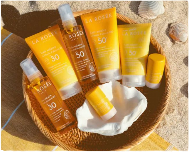
SpaceNK
- fixed promotion template
- clean white backgrounds that let product imagery lead
- strong typographic hierarchy (brand always outranks category)
- quite cold and corporate in tone, it would feel impersonal for a smaller boutique like The French Pharmacy which has a warmer, more curated identity
- the consistent banner layout system
- the way brand name size and weight never changes between promotions
- the dual grid structure for product images but instead used for brand navigation (as logos)
- more content-dense and unintuitive menu navigation, multiple carousels, editorial content, and promotional strips competing on the same page
- uses and alphabetically structured brand menu, which makes it easy to find brands
Cult beauty
- seasonal menu reordering; positioning of treatments and services near the top of the navigation as a primary USP rather than a secondary category
- very editorial and image-heavy which would require significant resource to maintain at that level, not realistic for a small independent pharmacy
- seasonal navigation reordering
Liberty London
The Company
The French Pharmacy is an independent London boutique stocking curated French skincare and wellness brands, but inconsistencies in the website's promotional banners and navigation were undermining the premium identity it was trying to communicate.
The Goal
My focus was on three areas: the promotional banner hierarchy, the navigation menu structure and the brand menu, which are currently all functional but aren’t communicating the brand as clearly as it should.
View Prototype
Research Objectives & Methods

- What makes a promotional banner hierarchy legible?
- How do users scan and navigate a category-heavy menu?
- How do comparable brands handle the tension between minimalism and legibility?
Primary User Persona - French Professional
Needs & Wants
"I trust this pharmacy's edit — I just wish the website made it as easy to find things as walking into the actual shop does."
Clara Du Pont, French professional
- Clear brand identity so she can immediately tell which brand is being promoted.
- A clear/intuitive navigation structure
- To browse by brand using logos she already recognises.
Clara Du Pont
Key Attributes
Pain Points & Frustrations
- Time limited
- Brand Aware
- Quality-sensitive
- Mobile- first Shopper
25, London, UK, French professional
Clara is brand-literate and values quality over quantity when it comes to skincare. She discovered The French Pharmacy after moving to London, and is drawn to its its familiarity and curation.
- She finds the current banner pages confusing and inconsistent
- The menu ordering doesn't match how she thinks about shopping.
- The brand page slows down discovery
Research Findings
Looking at comparable premium beauty retailers informed several of my recommendations.
These approaches aligned directly with what the client expressed she wanted: a site that felt more coherent, more professional, and more reflective of the quality of the products inside it.
Current Concept & User Insights
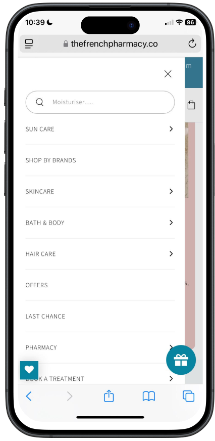

Unintuitive Ordering (Treatments, the service the client wanted to promote , was buried at the bottom of the menu below categories, and Suncare is at the top above Brands, which is their USP)
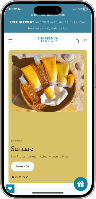
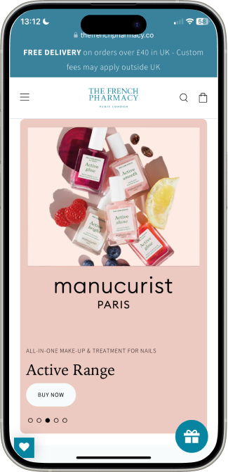
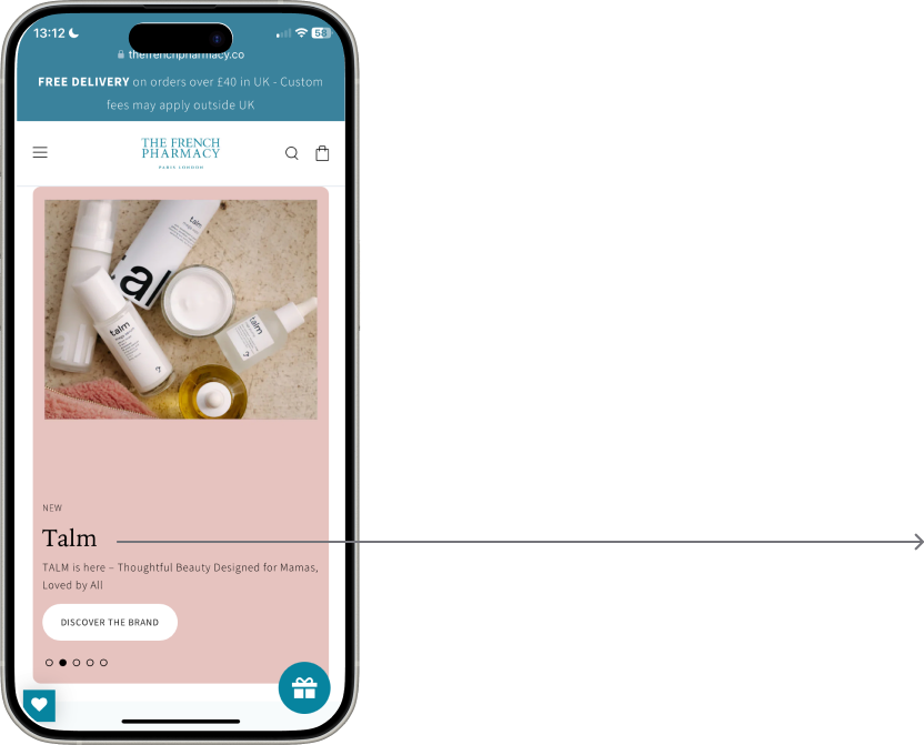
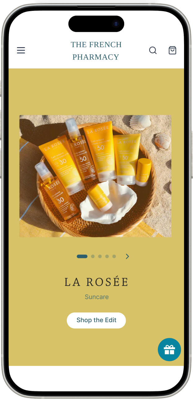
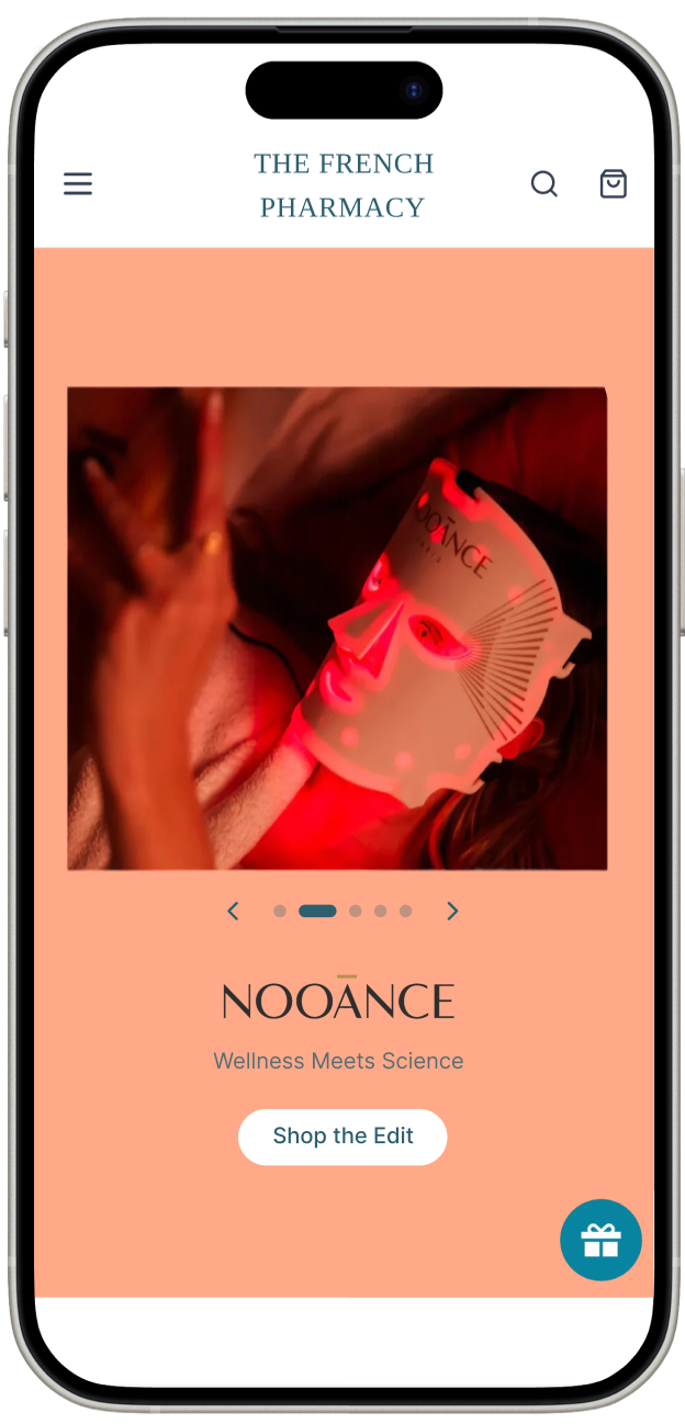
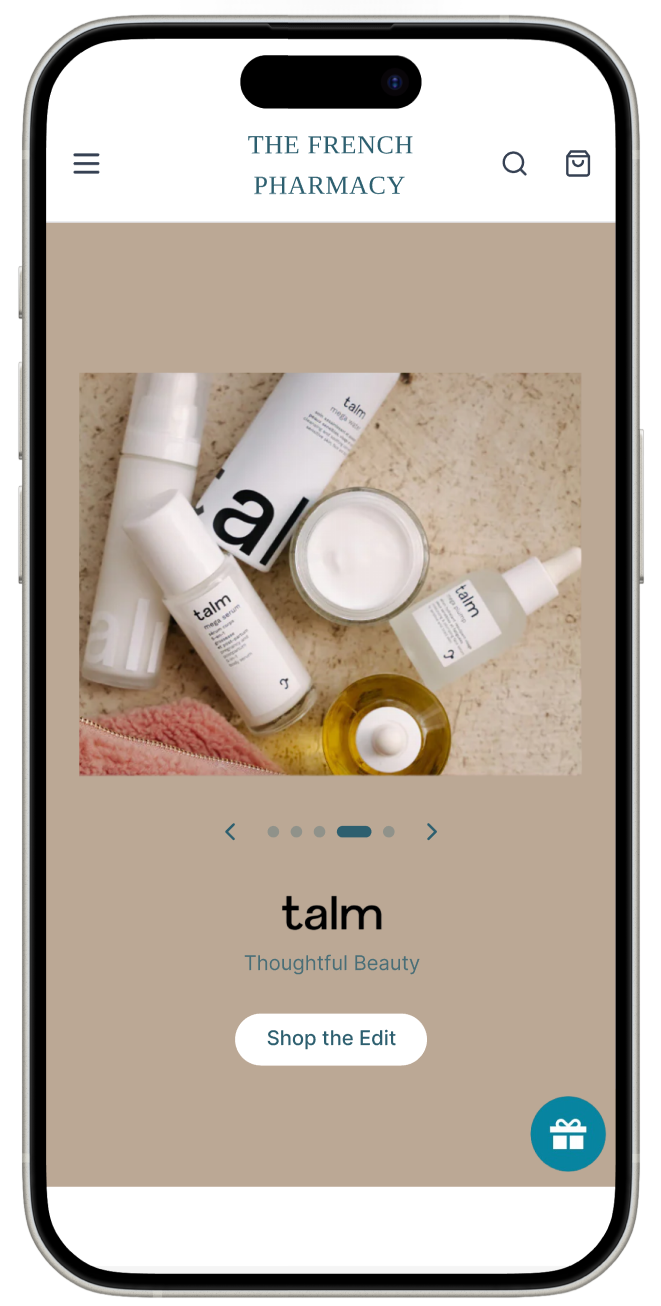
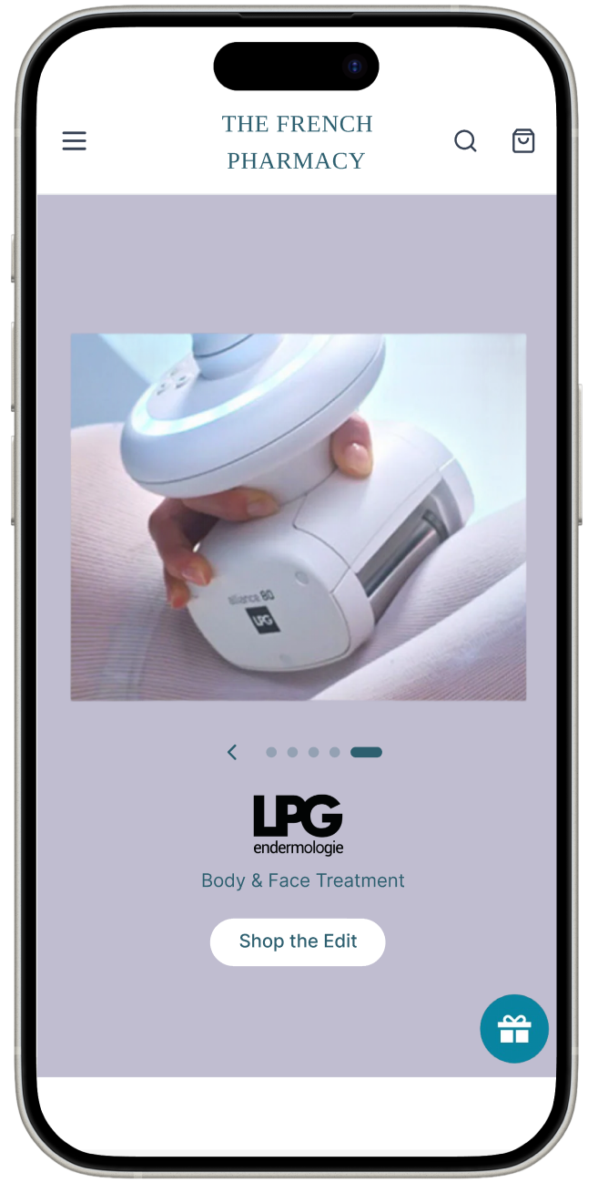
Inconsistent typographic hierarchy (different font/layout on each banner page)
Brand name undersized (product type dominates over brand name across each page)
Background colours too similar (some banners used near-identical background tones, creating a false impression that consecutive pages were related)


Overlapping Categories (Offers and Last Chance served the same function and contained many of the same products, creating unnecessary duplication)
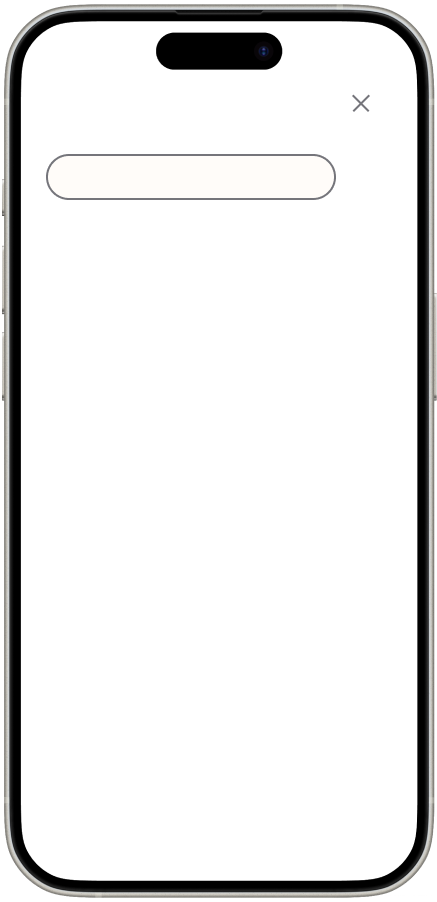
Bar Placeholder (the prompt "Moisturiser…" is too specific and implies the search function is limited in scope)


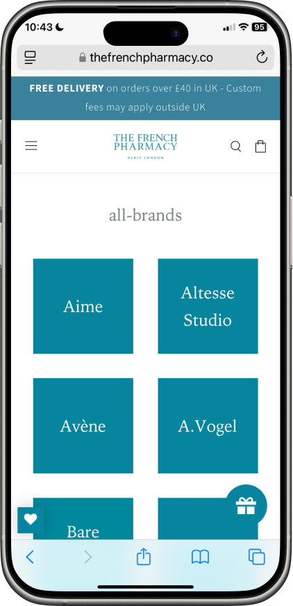
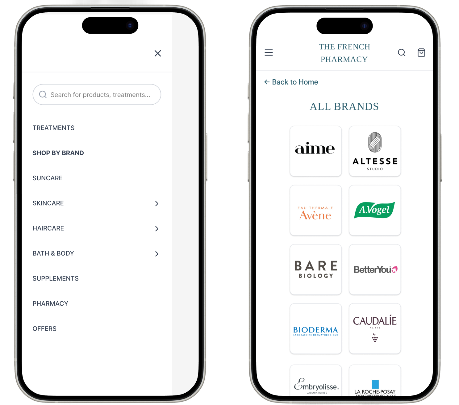
Brand Grid (displayed brand names typeset in tiled blocks rather than showing actual logos, making brand recognition much harder for users who browse by visual identity)

Pain points
2
3
1
Inconsistent promotional banners
Navigation menu unintuitive
Brands menu uninviting
Colours too similar, typography hierarchy different
Disorganised menu, search bar prompt confusing
Difficult and time consuming brand recognition
create consistent banners,reorder the navigation menu and redesign the brand browsing experience.
Laying the Foundation
With the pain points identified, I worked out the most intuitive layout option, which solves two insights: consistent typographic hierarchy (when used for all banners) and brand name domination of the frame.
Product Type
BODY
Brand


#D7C267
#BBA995
#E4BCB2
#FFA988

#C0BDD0


#ECC9C1
#E6C3BF
#E1D4D1
#D7C267
#E6C3BF

The current palette uses near-identical background tones across four of the five banners. The proposed palette draws directly from each banner's imagery, creating distinction while keeping the palette consistent with the brand's visual language.
Interface Descision-Making
TREATMENTS
SHOP BY BRAND
SUNCARE
SKINCARE
HAIRCARE
BATH & BODY
SUPPLEMENTS
PHARMACY
OFFERS
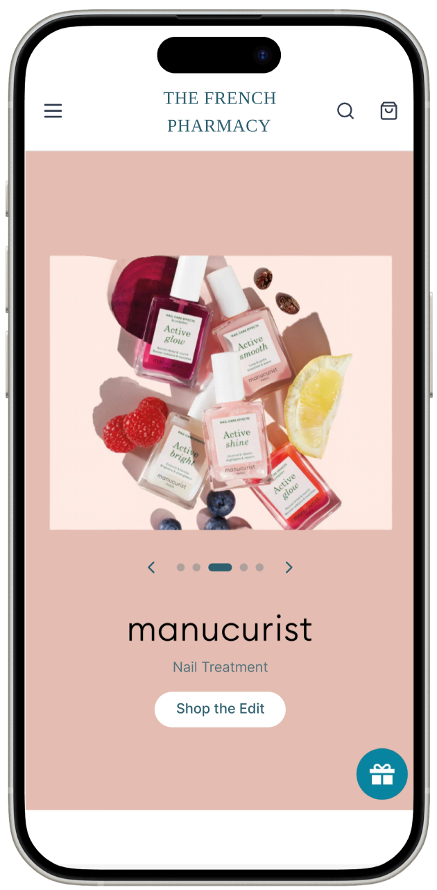
Banner layout
Menu layout
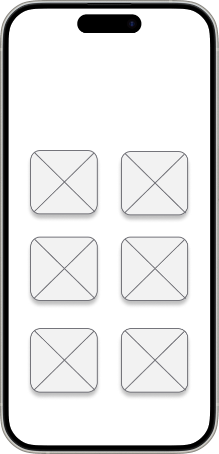
ALL BRANDS
Brand page layout

Takeaways
This project taught me that UX doesn't stop at the screen. Communicating decisions clearly to a stakeholder, and finding the middle ground between their needs and their users', is its own design skill. She responded positively to every recommendation but couldn't implement them due to time, which was a reminder that good design always sits within someone else's constraints and priorities. If I could take it further I would have spoken directly to users of the website to understand which visual elements genuinely influence trust and purchasing decisions. The comparative analysis was a strong foundation, but real user input would have made the recommendations much harder to set aside.
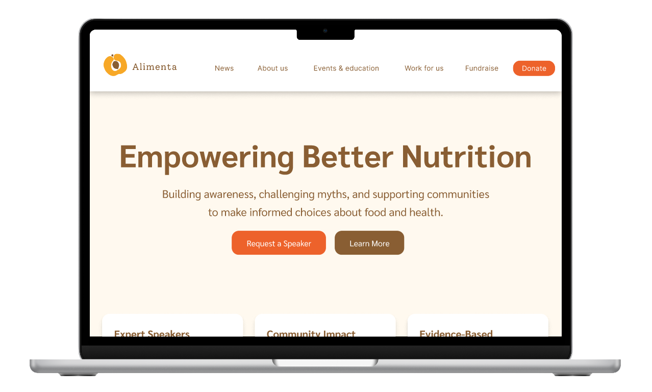
Alimenta
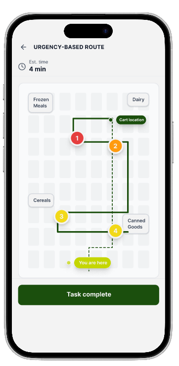
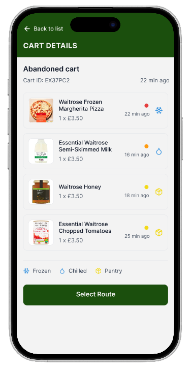
Zebra’s Abandoned Cart Recovery
Next Projects:
Comparative study of brands operating in a similar premium beauty and pharmacy space
Impact
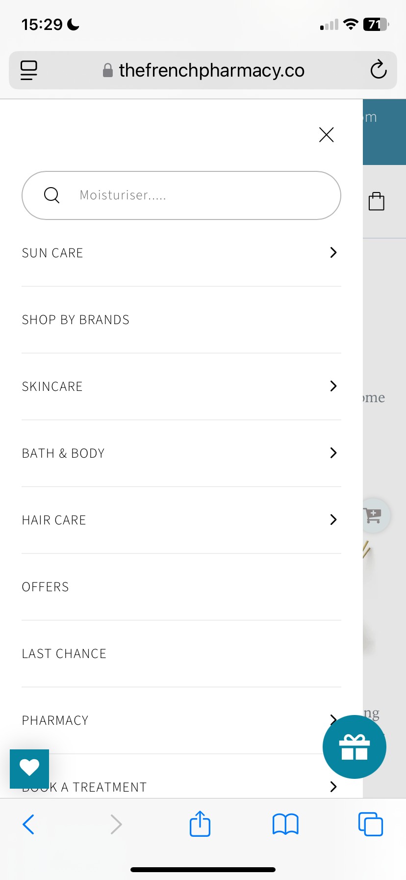
I selected three Search Bar prompts, the original was confusing and didn’t support the search icon into indicating that it was a search bar. The user should feel the full scope of what the site offers rather than feeling directed to one product type.
1
These pain points led me to think about how I might...
Analysis of current website
Conducted a close analysis of the existing site and identified weaknesses in the current design
2
Comparative analysis

Final Banner Layout
Final Menu Layout & Search Bar Prompt
Visual Element
Emotion


Consistent Hierarchy
Redesigned Colour Palette
Reconfigured Menu
Reformulated Search Bar Prompt
Brand Logos
Clarity
Cohesion
Ease
Invitation
Recognition
Reduces cognitive load
Removes the false impression that consecutive banner pages are related
Surfaces the pharmacy's key USPs
Encouraging users to discover rather than just retrieve
Removes the friction of having to read every tile to find a familiar brand
Impact
Find what you’re looking for...
Moisturiser...
What are you looking for...
Search the French Pharmacy...
Final Brand Page Layout
search prompt

Professional · UX/UI redesign · Mobile e-commerce · Navigation · Promotional hierarchy